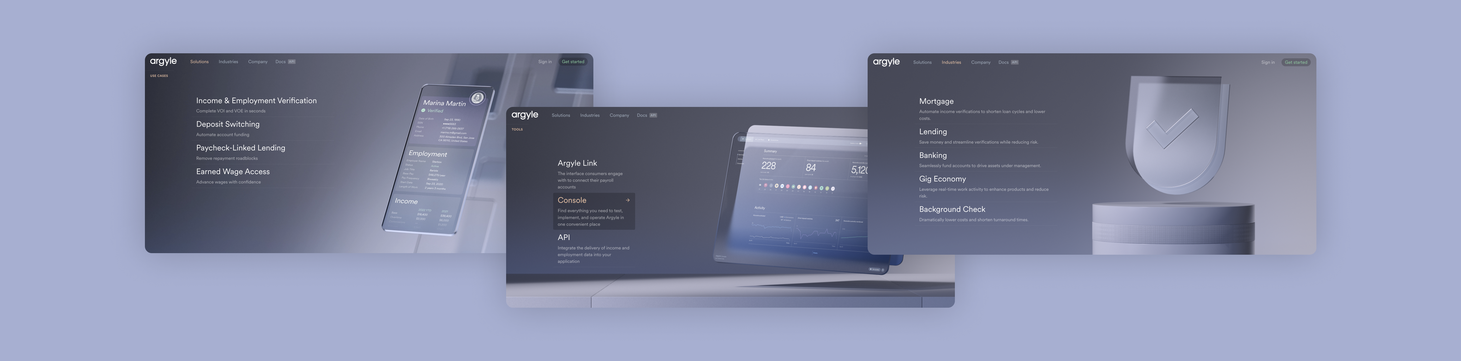
VoIE? 2FA? SOC 2 Type II? Argyle clearly communicates the major benefits of real-time employment records
The client
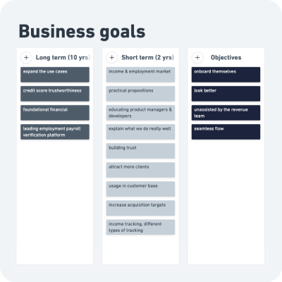
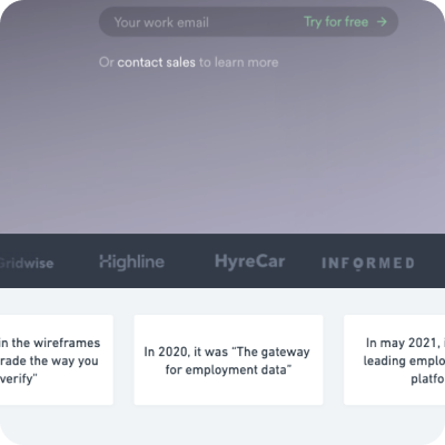
Argyle takes on the corporate giant that is Equifax to become the most accessible and fastest network for income and employment data. They’re growing their fully remote international team and want a matching website that clearly communicates their mission. To modernise financial services, improve data sharing efficiency and increase customer satisfaction with their lenders.
Target audience
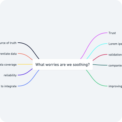
When you’re talking about Argyle’ core business; you’re clearly speaking to a B2B market; lenders, bankers, mortgage, etc. But you’re also tapping into ‘newer business models’ like remote workers and gig economy (hello freelance food delivery) — so there is a big gap between the non-technical CEO of a bank and their financial tech advisors who wish to optimize the flow of business. You’ll want to address both their concerns and clearly communicate the solution.
Design challenge
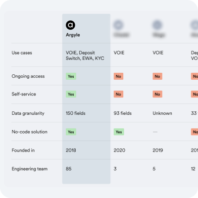
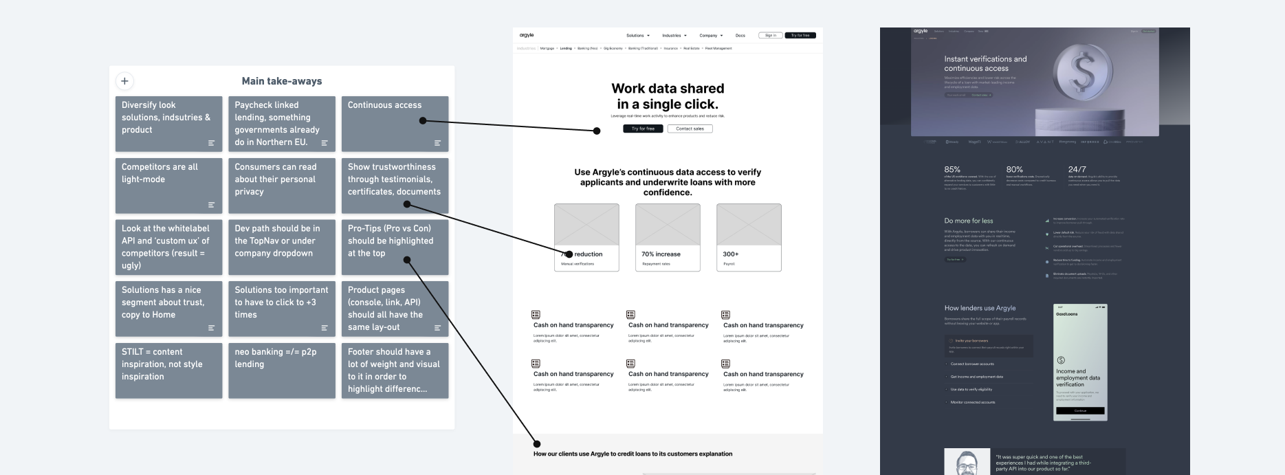
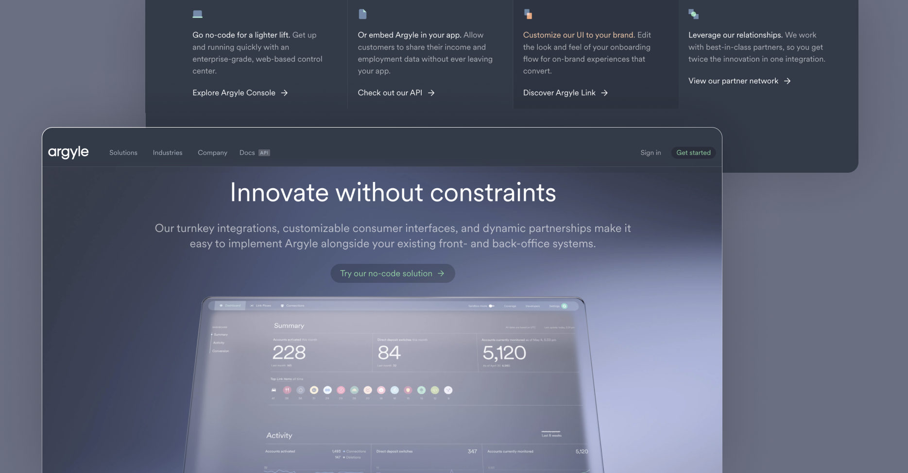
The original website was engulfed by graphics of data transferring from 1 app to the other, and another, and another. It made it more confusing than it was. The biggest goal is to differentiate between their core solutions, what tools are part of the solution and for whom they are meant.
UX services
User research
Remote collaboration session
Intro to A/B testing workshop
Information architecture
Remote design hand-off
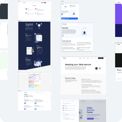
Wireframes through 5 iterations
Responsive design
Technical hand-off
Internal QA
Project management
Conducted
2021
Remote collaborative session workshop
Remote collaborative session workshop
Competitor analysis
A/B testing heading copy
Good, bad & interesting patterns
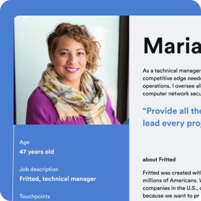
technical manager & non-technical ceo
The integrity of the research and wireframes done prior
What has been my biggest career achievement was the Head of Design of Argyle defending the hard work that had been done during the UX process when the visual process ensued after.
They felt the visual designers weren’t upholding the insights the research provided and took it upon themselves to translate the wireframes into sleek designs.
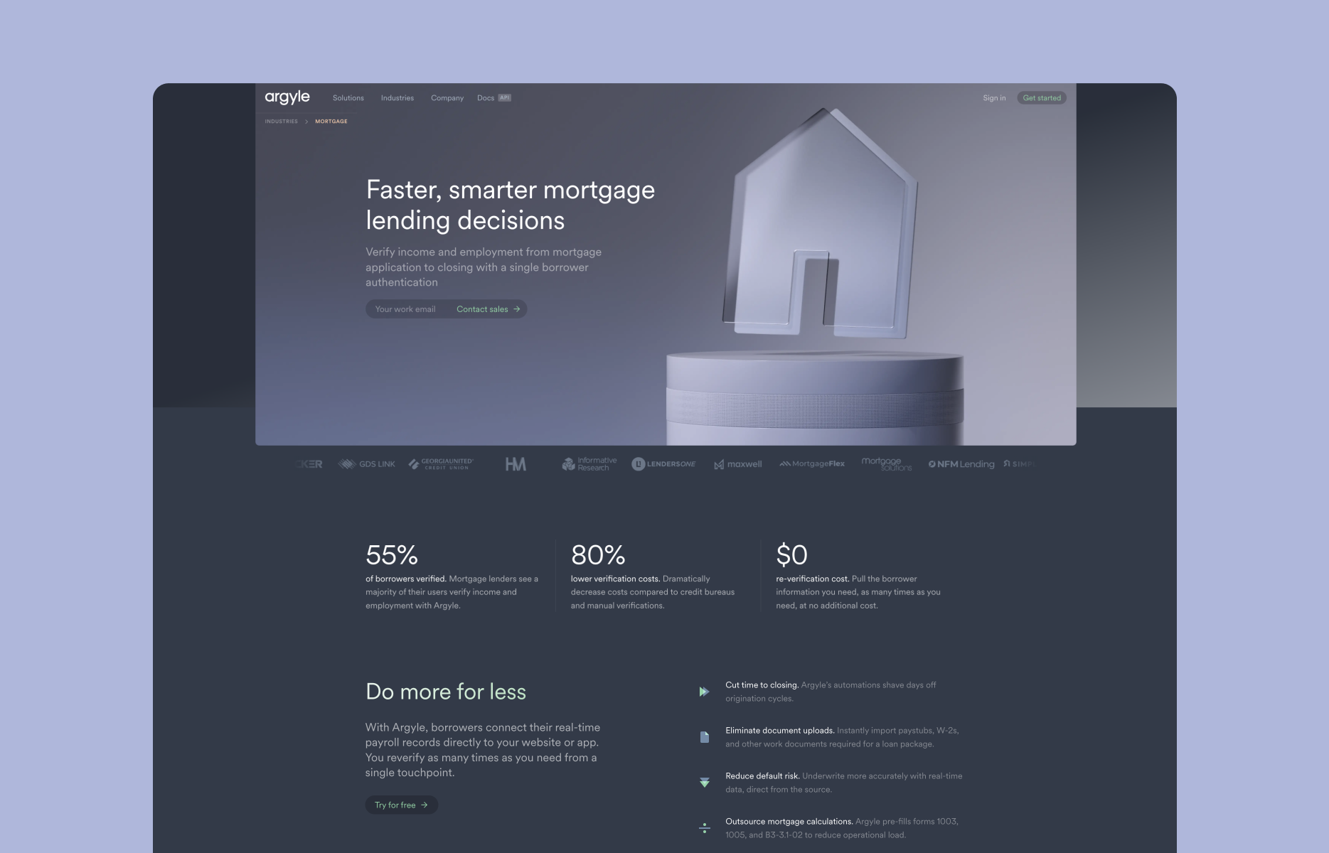
It made me more confident in my abilities while showing the power of collaboration between designer and client. What has launched since then is the clearest, most sleek dark mode fintech brand on the World Wide Web 🙂
Personal design language
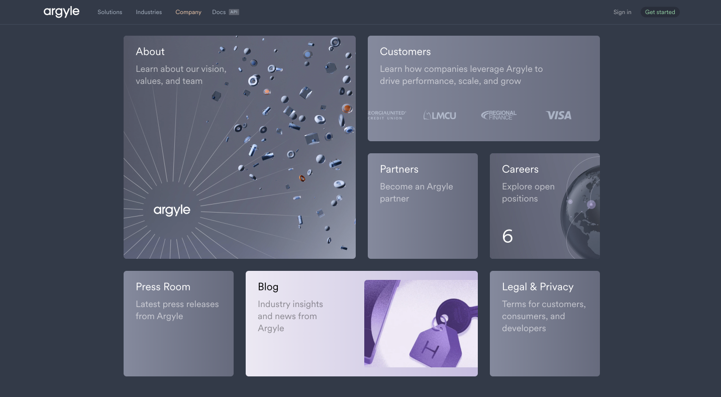
With the new website in place, Argyle has shaped its brand further over time. Adding new UX layers, landing pages and card types. My favorite is when you go to the company about page, you’re greeted by a modern bento-grid. Excited to see what they’ll implement in the future.
Other projects:
Thank you for taking your time here.
If you have questions, don't hesitate to contact me through the means stated below.